CoScreen is a radically different collaboration platform with a unique interface for agile teams. This post sheds some light on how the UI of CoScreen 1.0 was designed by some of the industry’s best interface designers.
Authors
- Till Pieper, Co-founder CEO at CoScreen
- Jason Culbertson, Design Partner at CoScreen
- Kai Rader, Design Director at MetaLab
Our product vision and design principles
The reason for us to create CoScreen was the struggle with the collaboration tools of today.
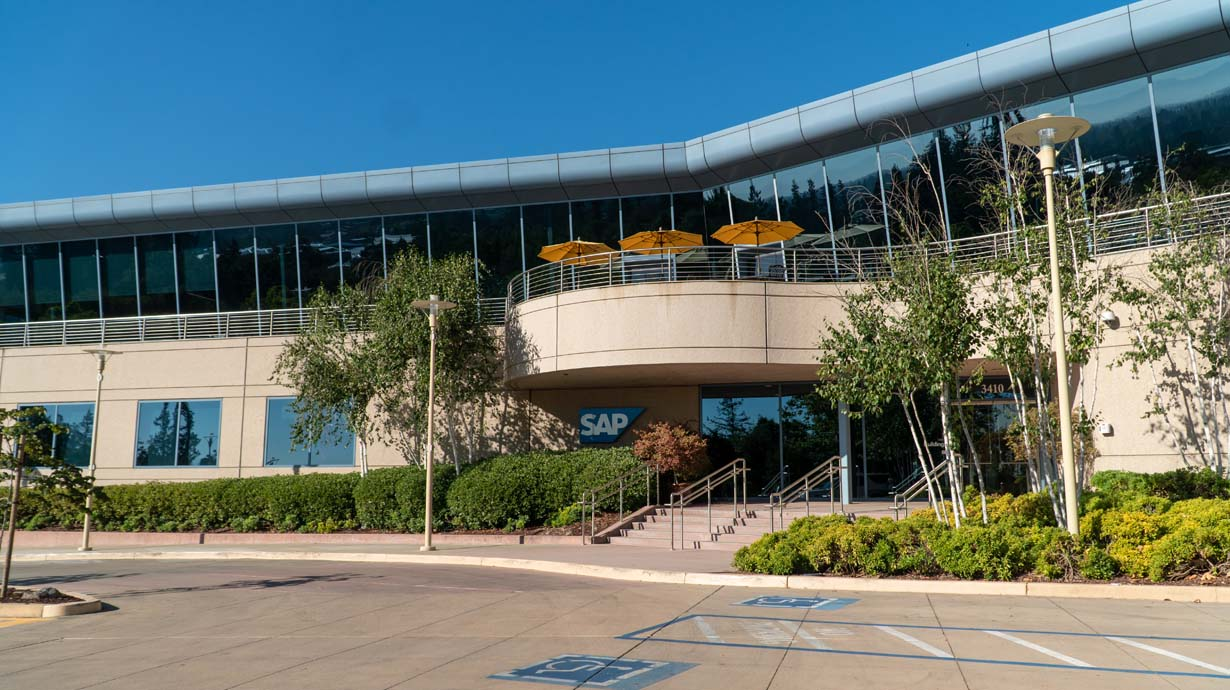
A couple of years ago, I was a member of a corporate skunkworks team at SAP in Palo Alto, California. We were a funky group of designers, developers, product managers, and architects who rapidly prototyped far-fetched technology visions. They involved tinkering with hardware, software, computer vision, natural language processing, and many other complex components. But first and foremost, they required frequent, lively, and interactive exchanges between us team members.
Some of us were collocated, some were hybrid, some were remote, some where travelling between various events. And no matter the setup, every attempt to share and collaborate on some digital insight or complex problem with the team took more than ten clicks, and it never felt natural. We also noticed that existing tools were highly focused on video chatting. Especially when remote, we didn’t want to primarily stare into each other’s faces but rather solve complex issues together, build great products together, and teach each other by working together.
And so, hugely frustrated after dozens of prototypes and iterations, I came up with a radically different collaboration concept that enables multiple users to collaborate seamlessly and interactively on a joint digital space. This concept and the first prototypes influenced what CoScreen is today.
Product principles
CoScreen enables a multi-user collaboration experience for remote teams on a shared desktop that's unlike every other tool out there. Max Andaker, co-founder and Chief Product Officer of CoScreen, laid out our product principles as follows:
- You must have the ability to share digital artifacts (e.g., application windows) with your fellow team members with one intuitive interaction as if there were no boundaries between computers, no matter your role or the place in your workflow.
- You must be able to interact with artifacts shared by your team members as if they were your own without any friction (e.g., application windows using mouse and keyboard).
- You must be able to collaborate at an instant without ever having to give up your privacy.
- You and your team members must get the natural feeling of being connected even when being remote through subtle audio and video chat - without making you tired or stressed.
Why great design is paramount for CoScreen
There were remote desktop tools, pair programming tools, video conferencing tools, file sharing tools, browser-based collaboration tools - but nothing even remotely resembling what we had in mind. With all our hopes and dreams for CoScreen laid out, it was painfully clear that strong design execution would be essential to fulfill our vision.
How we chose MetaLab as our design partner
As the founding team, we have led product and engineering efforts of rock-solid enterprise applications, developer-focused platforms, and engaging video conferencing apps at Google, SAP, HireVue, and other great companies. We decided that we wanted to work with the very best design partner on this unique project as we knew that building such a radically intuitive and interactive application wouldn’t be easy.
To start off, we wrote a design brief to capture and align our beliefs, convictions, and requirements about the unique collaboration experience we were envisioning. Using the brief, we approached a couple of agencies we had heard good things about from our network and who had a strong focus on interaction design. After an initial shortlisting process, we shared a second, extended version of our design brief under NDA with the remaining candidates.
The final decision was taken based on the following three criteria:
- The strength of referrals from within our network & ecosystem who have worked with them directly.
- The strength of their portfolio, specifically the apps they were involved with developing and how engaging and delightful we regarded them.
- Their agility and ability to move fast as we were planning to (and did) start developing the new UI halfway through the design sprint and caught up with the design by the end of it.
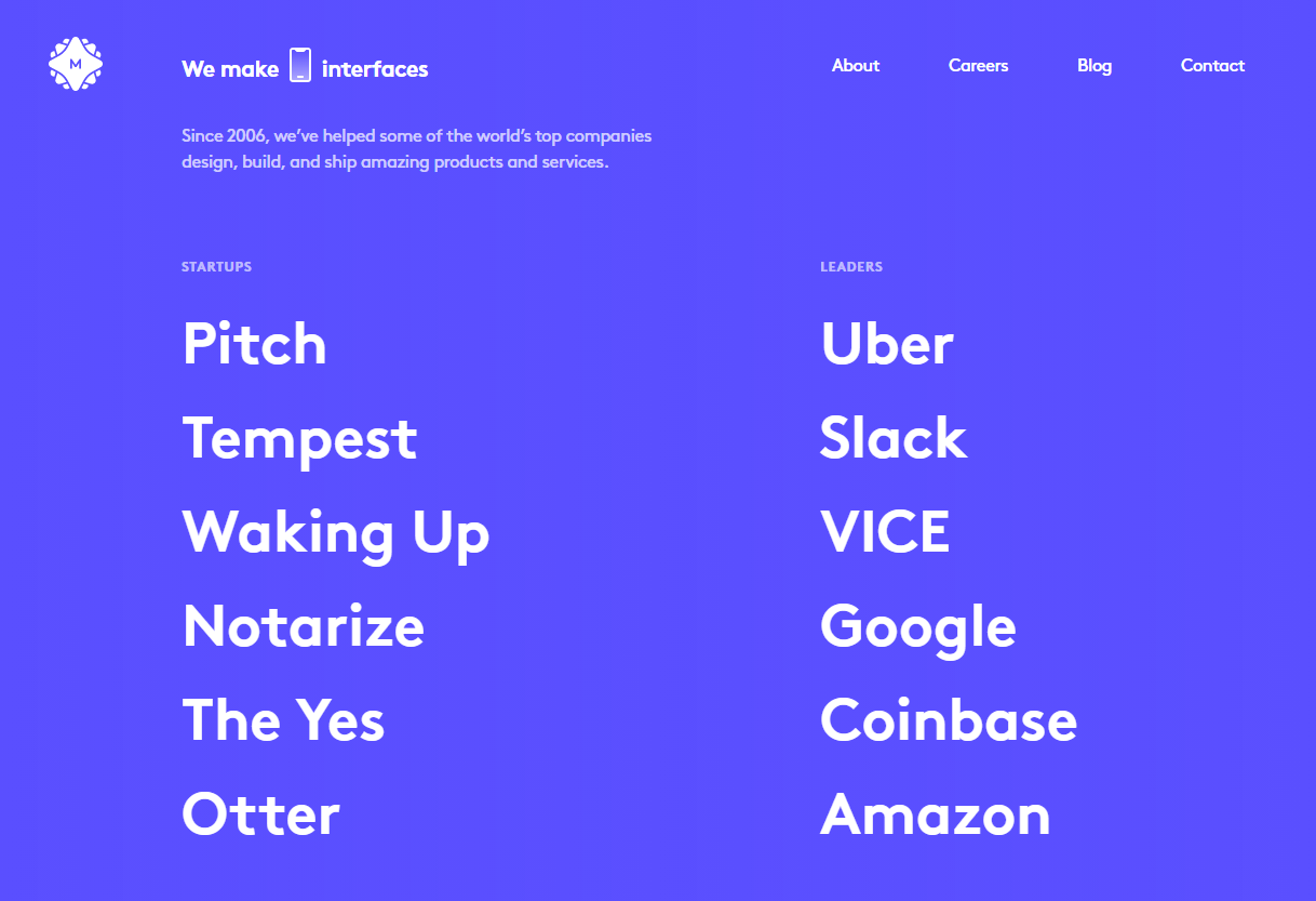
And that’s how we decided to move forward with MetaLab, a highly reputed product design agency known for their work on Slack, most recently on Pitch, and on a variety of other great productivity tools we looked up to. The process we outlined together was straight forward and we were able to agree on a timeline that worked for our fast-paced schedule and yet also the unique requirements for our product.

The creation of the original design of CoScreen with MetaLab
By Kai Rader, Design Director at MetaLab
The CoScreen team reached out to us with their product vision and a thorough understanding of the users they were targeting — primarily remote developers but also members of similarly agile teams.
A critical factor of any successful design project is knowing your audience: designing for everyone is designing for no one.
We defined a tight project schedule of only six weeks as the CoScreen team had already defined their MVP feature set.
Designing CoScreen with a creative-first approach
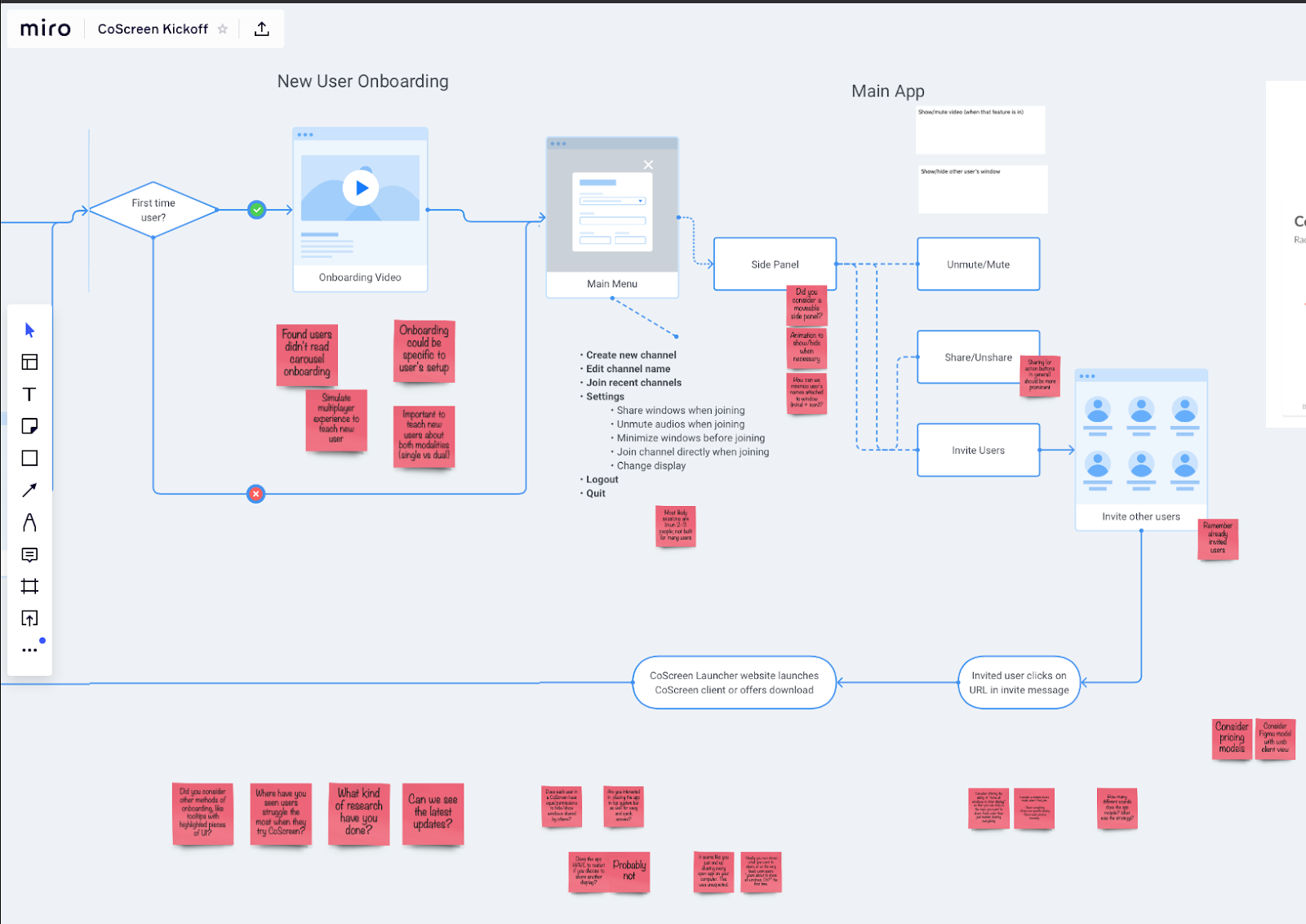
Given the short timeline, we took a design-first approach. As we were in the first months of the pandemic, we kicked off the project with a remote workshop via Zoom and the collaborative whiteboard software Miro. We discussed CoScreen’s hopes and dreams, their fears and concerns, and got to know each other as people. We also walked through the ideal user flow documenting opportunities and pain points based on the learnings from their initial prototype.
Fast-paced design and product iterations
We split the following weeks into five design sprints with two weekly synchronous checkpoints via Zoom and asynchronous discussions via Notion, a joint Slack channel, and Figma comments. We came up with four design concepts in the first few days. We then moved quickly from wireframes to high-fidelity designs, accompanied by usability testing. While our product designer worked on the actual app, the CoScreen team worked with a UX writer from MetaLab to craft the text of the onboarding flow. In addition, we refreshed CoScreen’s logo and created custom iconography to match the app UI.
After every design sprint, we shared the latest design snapshot via Figma with the CoScreen team and where we needed additional input in Notion. Max, Till, and the entire engineering team responded with detailed feedback within 24 hours on what they liked and didn’t like which was essential given the fast-paced nature of the project.
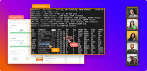
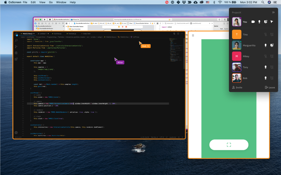
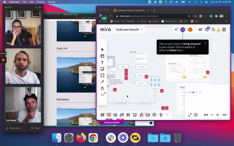
We worked through a variety of challenges due to the unique nature of CoScreen’s concept and its intricacies because there were often no existing paradigms to build on. For example, the concept of sharing individual windows intuitively by showing tabs above them came up early in the design process. It’s still the primary way for users to share windows in CoScreen to this day. It was also important to make it obvious which user was sharing which window and to indicate to the local user which windows were shared and were not shared.
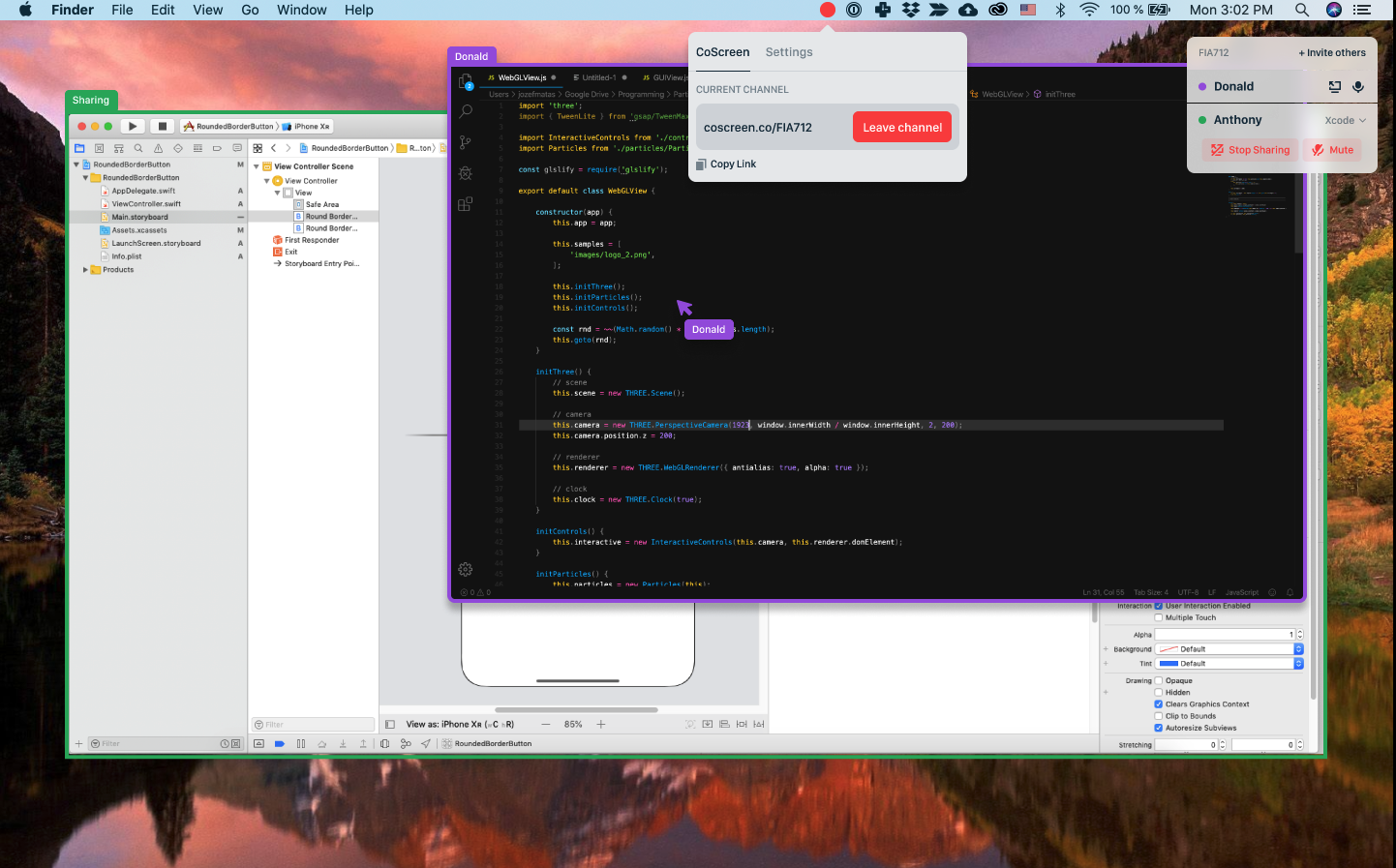
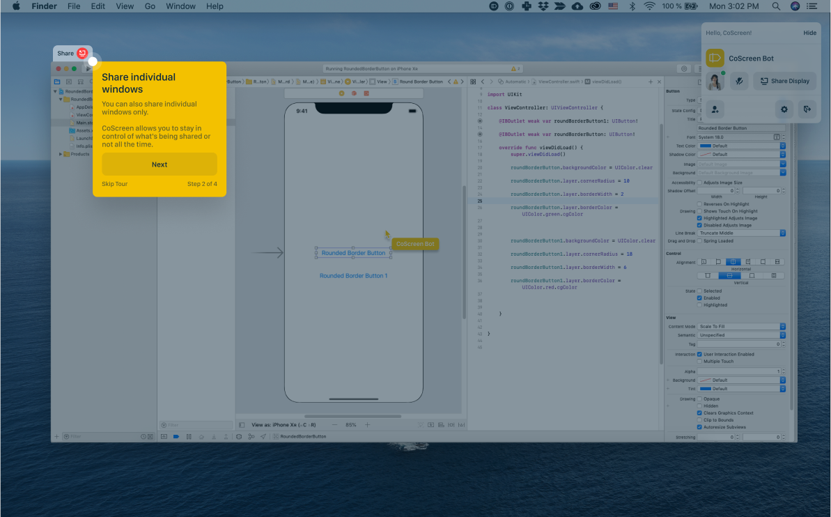
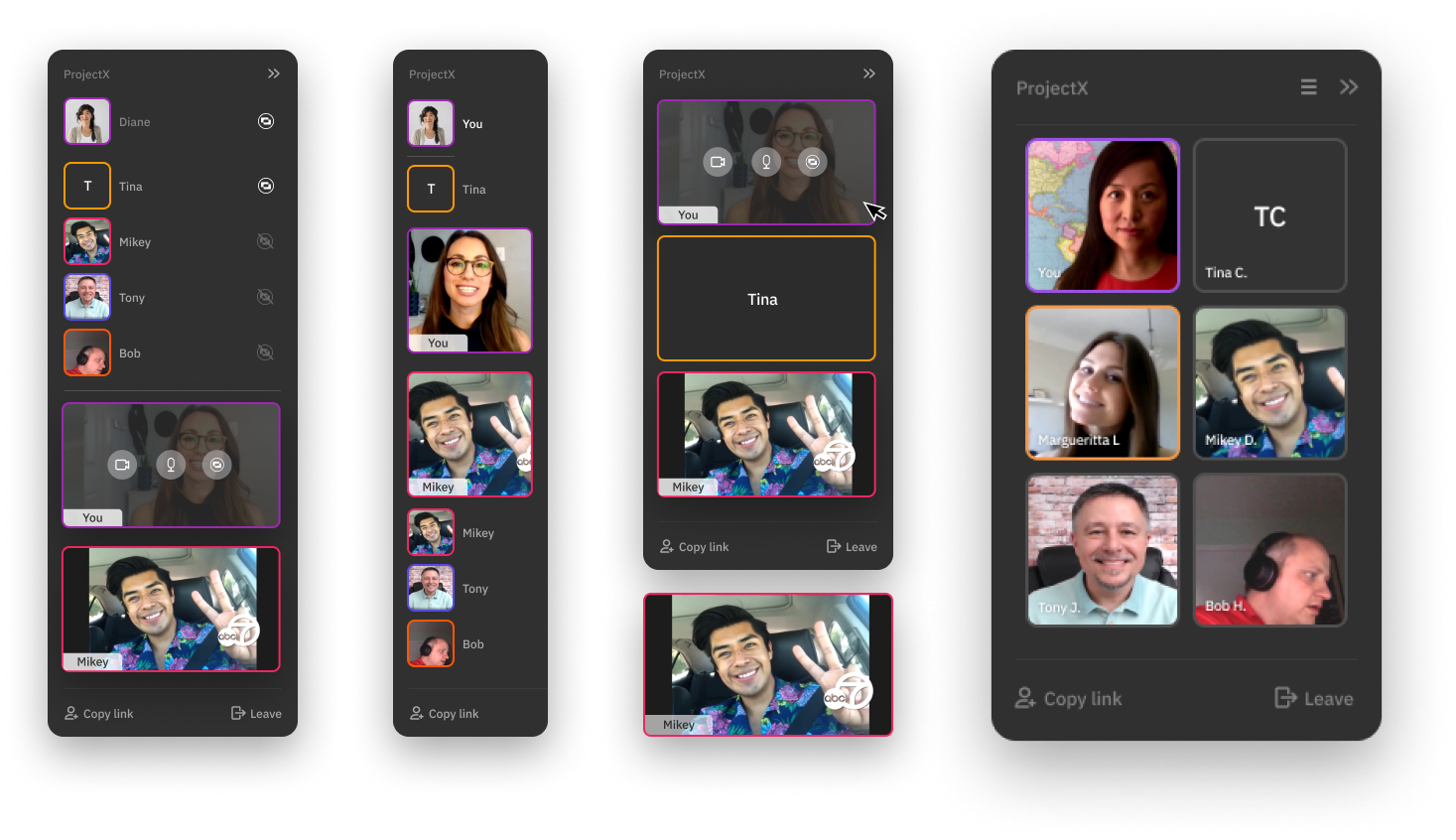
We also explored alternative concepts on how to display in-session participants and controls. While there was an increasing number of circular-video apps, we decided to favor a simple, flexible UI that gave us the ability to show additional details.
The end result & lessons learned
Our frequent iterations enabled us to solidify a UI concept early in the project, un-blocking the CoScreen development team. It combined the many learnings the joint team had gathered and distilled them into a yet highly intuitive collaboration experience that’s become the foundation of the product.
There are a couple of crucial aspects when working as a design agency with startups like CoScreen. Those teams are naturally small and time is of the essence. It is hugely beneficial if teams come with a strong understanding of what your—or rather your customer’s needs are and what the key design challenges were that needed to be solved. Secondly, CoScreen was highly responsive and was able to turn around with feedback quickly and that enabled us to move fast.
We’re proud of the new collaboration experience we were able to define together and are excited that remote teams around the world will benefit from its unique capabilities.
Design & product iterations towards CoScreen v1.0
By Jason Culbertson, Design Partner at CoScreen (formerly at Airbnb, Unity, and Yammer)
I had reached out to the CoScreen team because I was fascinated by the unique concept that the team had shared on Product Hunt and Hacker News. At first, I gave them some feedback on their prototype and the foundation they had established with Kai and the team. Over the following weeks, I got more involved to explore different angles of the product and vision, also building on the over 100 customers interviews the team had done just over the course of the private beta.
Working on CoScreen is a fascinating undertaking because, even though it’s initially focused on engineering teams, its UI and overall user experience are core to the product and the founders.
Unlike many other developer-focused tools, the team is laser-focused on making CoScreen extremely easy to onboard and to use, no matter if you are a junior, or a senior engineer, or team member.
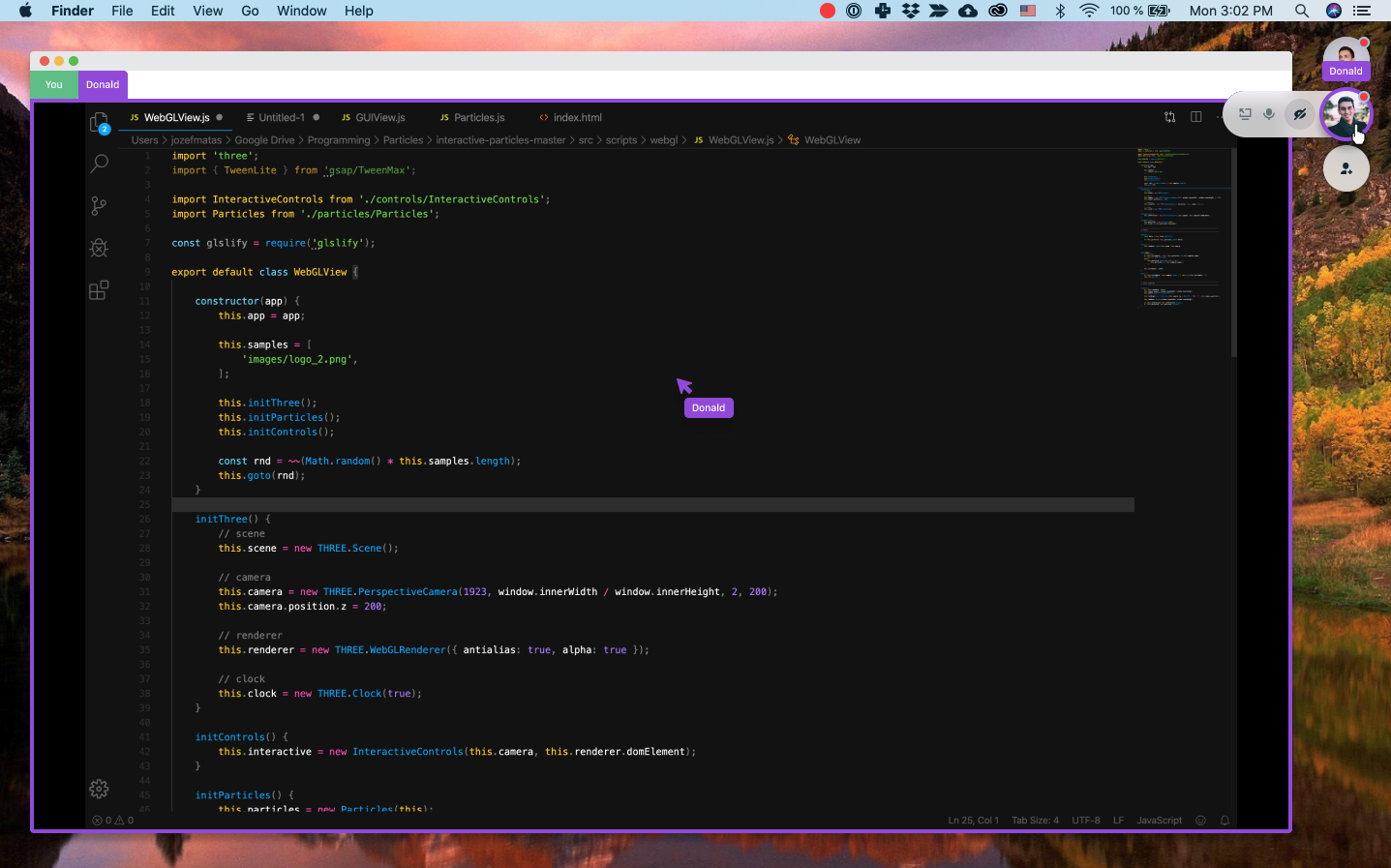
Subtle video chat that doesn’t wear you out make you fatigued
One of the first features we’ve dived deep into was video chat. The most popular video conferencing tools like Zoom, Google Meet, and Microsoft Teams are focused on formal meetings and the act of presenting. Seeing other users as large webcam feeds is literally front and center for them.
In contrast to that, CoScreen is about working together interactively on shared applications. We wanted to create a tool that is focused on our work and our collaboration and less about staring into each other faces. Everyone is different, and well, not everyone thrives when they feel watched or broadcasted on a big screen. CoScreen’s video chat feature was merely to capture nonverbal cues to better communicate and eliminate misunderstandings while the artifact that’s being worked on is the main focus.
And yet, while CoScreen’s users were loud and clear that they were tired of traditional video chat tools, they wanted a subtle way to see each other. We also learned that users wanted to use it differently. Some didn’t want it at all, some wanted it small and a few even as large as in Zoom & Co. So we had to design a solution that was flexible and never in the way of our users, we had to create a new paradigm for video chat.
After multiple iterations with early users, we opted towards optional and minimal video feeds but allowing users to scale them within a limited range to keep the focus on collaboration, not on each others’ faces.
Designing a new collaboration paradigm
Working on CoScreen was very different from my time at Airbnb, where I was the Head of Design for Guest Experience from search to checkout. There, we could rely on a trove of user research, data, and experiments which was not at all the case with CoScreen.
CoScreen’s concept was and still is unique in the industry, so there were few examples to build on, and there was also only little data as the product was still in early dog food testing with only a handful of teams. Therefore it was difficult to prove if something was intuitive and well designed. But at least we got some signals when users stopped complaining after we addressed a certain pain point.
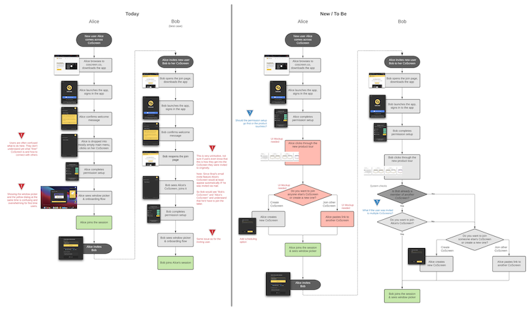
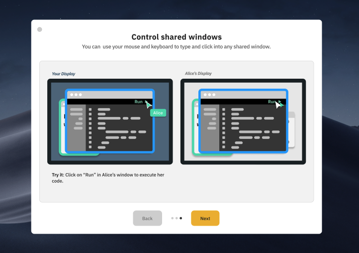
One of the particular challenges of the project was the onboarding flow. CoScreen centers around a highly intuitive collaboration experience and builds on modalities that any GUI-based operating system supports - like example application windows and the ability to interact with them using mouse and keyboard. But because the concept is so different, we had to help users bridge the gap between the existing solutions they knew to the new way of doing things in CoScreen. We explored many different alternatives to onboard new users and dug deep into insights and learnings from early test users and our expanding UX research efforts.
Looking ahead: designing CoScreen 2.0
I believe strongly that the problem we’re solving is the ability for people to replicate and even augment the ability for them to work as if they were sitting right next to each other at the table. We’re differentiating ourselves in a way that other video and collaboration tools replicate formal meetings and communication channels instead of casual and ephemeral collaboration. We create a different type of work environment, we’re not focusing on company-wide, large-group meetings but rather tight teams of fewer than 10 members who work tightly and often together. We’re always reverting to this metaphor whenever we design new features and iterate over the product.
I also believe that CoScreen’s use goes far beyond engineering teams and includes and also includes designers. Tools like Figma have amazing pair-design features but the ability to collaborate across multiple designs at a time, to follow along across teams, and departments, and even across different types of software via CoScreen is very powerful (e.g. Adobe Photoshop, Sketch, Canva, other marketing design tools).
What we learned while designing CoScreen
On December 3rd, 2020, after an intense development phase of 6 months, we made the first version of CoScreen for macOS publicly available for free, followed by our Windows version in March 2021 (more here). The positive reception from great companies like Okta, SAP, Root Insurance, Salesforce, and many others have shown us that we were on the right path to change how agile teams around the globe collaborate, and yet we’re only getting started.
A few takeaways that we’d like to share on how we designed the first version:
- Having a central metaphor for the product and a set of core principles was essential as it enabled us to always anchor even wild and far-fetching ideas in and to prioritize them.
- The approach to outline and share fairly detailed design briefs helped us and potential partners to clarify the scope of the collaboration, accelerate the selection process, and also kickstart the actual design phase.
- Being closely involved as co-founders was crucial as we could introduce the many things we had learned over the dozens of prior prototypes into the process. Additionally giving detailed feedback frequently was essential.
- We had a clear vision around the seamless interaction experience we wanted to provide with CoScreen but that didn’t mean that designing it intuitively was easy. And therefore, when exploring new frontiers like with CoScreen, working with the best-possible partners was worth the investment and saved a huge amount of time and iterations in the long-term.
- Leveraging a combination of leading Deep Collaboration tools like Figma, Miro, Notion, and of course, also CoScreen with great async tools like Slack and Loom enables a smooth remote design process even in a globally distributed team.